
Pastels – we see these tranquil tints in the wings of flamingos, scoops of sorbet, and sunset skies. Care for a macaron or a pink lemonade popsicle? My answer to this is always yes.
As a watercolor artist, I love to paint these sweet indulgences and capture their memorable colors, but sometimes my palette feels limited. Pastel tints are by nature less saturated than primary and secondary colors, and when creating them using watercolor paints, one can achieve the lightness via two techniques. The first involves mixing a lot of water with a little bit of paint. However, this technique makes it difficult to produce vibrant pastel shades using traditional watercolor hues. A second option involves mixing some white with a color, but this compromises the lovely transparent nature of watercolor layers.
Time to try something new: Derwent’s brand new Pastel Shades Paint Pan Set.
Materials used for this exploration:
- Pastel Shades Paint Pan Set
- Inktense Paint 24 Pan Palette
- Metallic Paint Pan Set
- Inktense Paper Pad 12×16
- Derwent Push Button Waterbrush Assorted Set
- Derwent Techniques Brushes
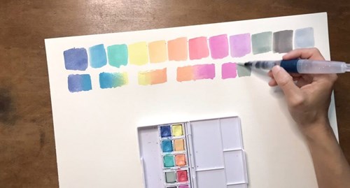
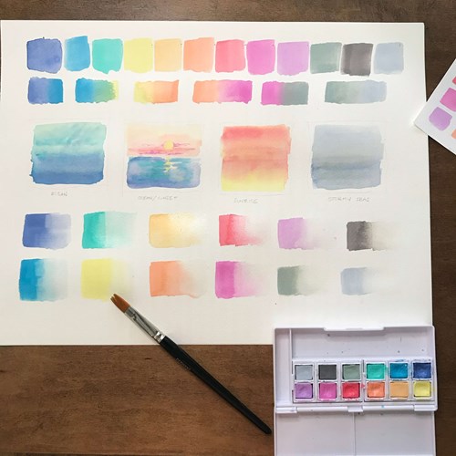
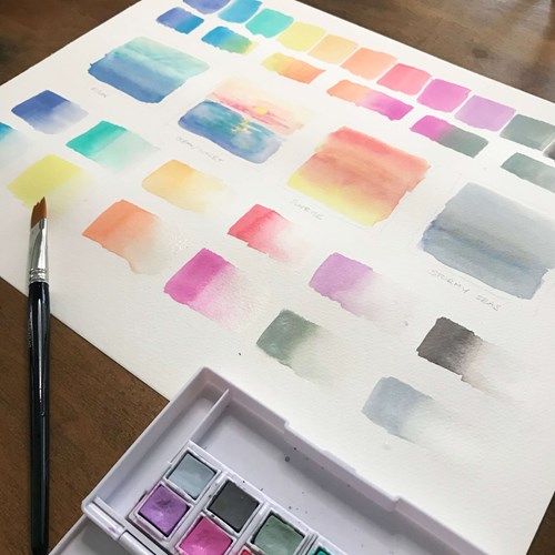
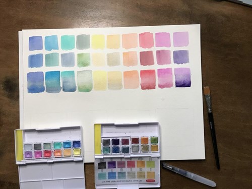
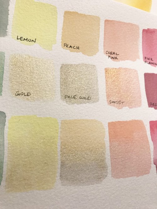
Pastel Shade Swatches
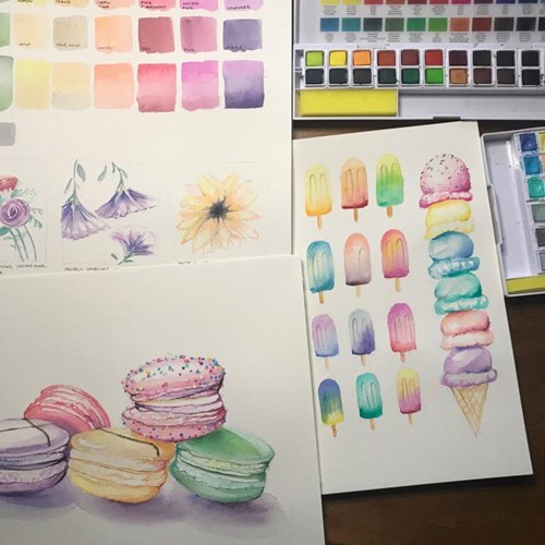
I began experimenting with the pastel colors by simply painting swatches. As with Derwent’s Inktense and Metallic sets, the pastel tints can be applied directly onto dry paper for an opaque cover or they can be mixed with excess water to achieve a gradient. I find it helpful to create small abstract landscapes as a creative way to test new materials.
In this case, I used Coral Pink, Peach, and Lemon in a sunset, Cornflower Blue and Turquoise in an ocean study, and Storm Grey and Silver Blue to convey a gusty sky over the ocean.
Swatching Pastel Shades
Swatching Pastel Shades
As a wildlife watercolor artist, pastels immediately remind me of flamingos. So, it was absolutely fitting when I found Flamingo Pink among the colors in the palette. I created two illustrations of flamingos, one that focused more on details of the subject and a second that explored the shades through a background wash. Peach, Coral Pink, and Orchid Pink were used to achieve shading on each bird, and I used a pop of Lemon for some sunny highlights. Cornflower Blue and Turquoise were used in the background sky and water wash. These paints are permanent once dry when using light washes, which makes for a user friendly layering process. This layering is how I achieved the most saturated pinks in the illustrations below.
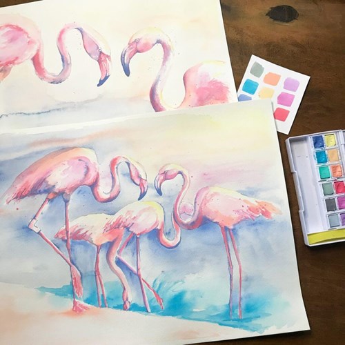
Flamingo Illustration
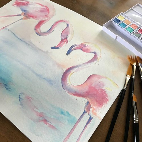
Flamingo Illustration
Real magic happened when I started combing multiple Derwent palettes to discover new techniques. Have you ever layered metallics over pastel shades? Not only did I find it relaxing to see the calming shades, but the addition of shine brought new dimension. The image below shows how these two palettes, Pastel and Metallics, can be used in combination to literally bring some sparkle to your illustration work.
Metallic and Pastel Shades Swatches
Metallic and Pastel Shades Swatches
For a larger floral study, I painted my wedding bouquet that was filled with light greenery and lavender petals, and the metallic paints provided the sparkle.
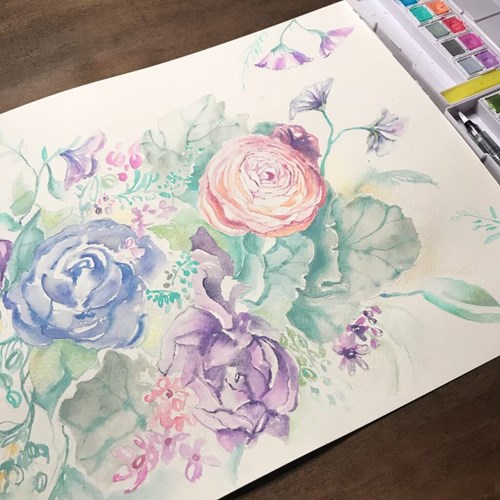
Metallic and Pastel Shades Floral Illustrations
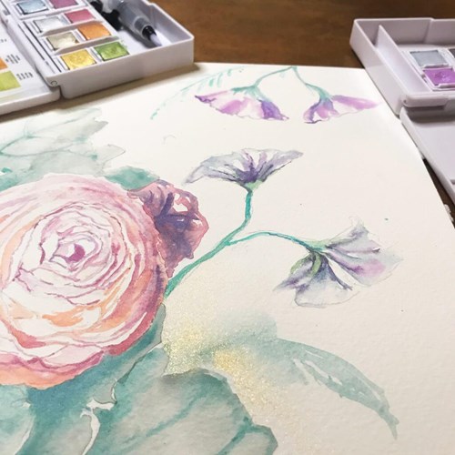
Metallic and Pastel Shades Floral Illustrations
From weddings to desserts, this palette just inspires sweetness. I am very fond of and familiar with Derwent Inktense Palettes because of their saturation and vibrant colors. When I saw the primary and secondary colors from the Inktense Palette, the pale shades from the Pastel Shades palette, and the sparkle from the Metallic palette, I thought of sugar coated and sprinkled macarons. The image below shows how I used (1) the pastel shades as a base color, (2) the Inktense palette as a way to achieve contrast shading and vibrancy, and (3) the metallic palette to capture the delicate sugary shell texture of a macaron.
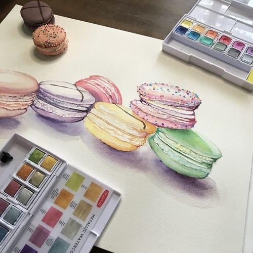
Macarons using Pastel Shades, Metallic and Inktense Paints
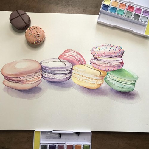
Macarons using Pastel Shades, Metallic and Inktense Paints
If you enjoy sweets and sunsets, I recommend trying the new Pastel Shades set from Derwent. Once again, Derwent has provided a compact, versatile, easy-to-travel palette that brings an entirely new dimension to your work. Enjoy!
Pastel Shade Swatches
Thank you to Abby Nurre for providing this blog for us. Discover more of Abby’s work on her website, Facebook and Instagram.