
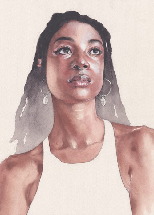
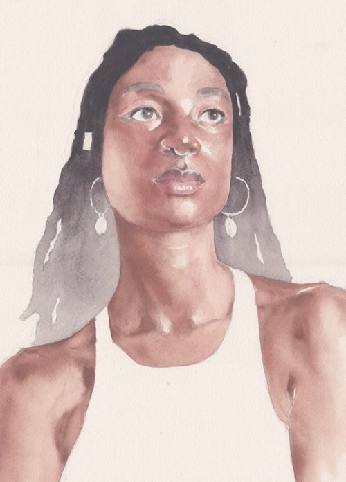
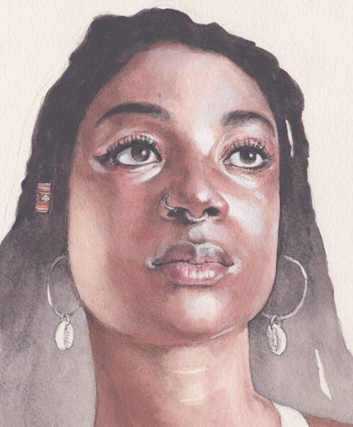
I’ve used Derwent’s water-soluble Graphitint pencils for years, so when they first started to introduce pan sets made from the same materials as their pencil cores, I was excited to see what would come next. The new Shade and Tone Mixed Media Set didn’t disappoint, and it was a particular treat to be able to use the set to create a new illustration using the mix of Inktense, Graphitint, Tinted Charcoal and Pastel Shades pans. Alongside the Derwent Graphic B, Onyx Dark and Drawing Terracotta pencils, the pans make a versatile mixed media set. In this blog I’m going to take you though some of the things I discovered when using it while I was making this portrait of my friend Priss.
First steps
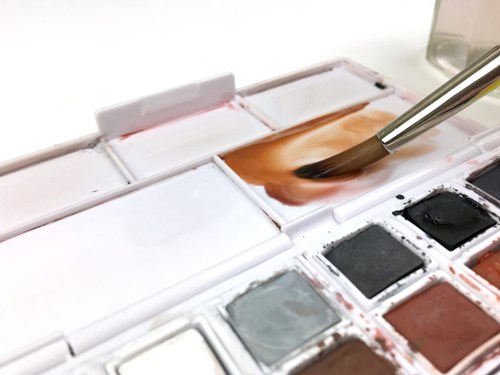
Whenever I get a new set of materials, I like to have a good play before committing to a more serious undertaking. So when the set arrived in the post, I put on some music and set about filling a couple of sheets of heavy cartridge paper with abstract marks to get to know the different colours, how the materials in the pans behaved and how they could be best combined with the pencils in the set. It is worth noting that as the pans from each range are comprised of different materials, they all behave in slightly different ways. So as well as getting to know how all of the different colours look on the paper, it is important to explore how the different pan-types act – the Graphitint compared to the Inktense and so on. I made myself a little swatch card to sit inside the set and found a photograph of Priss to draw from before settling into the main illustration.
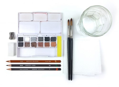
Materials
From the Shade and Tone set:
- Shade and Tone Paint Pan Set
- Graphic B Pencil
- Onyx Dark Pencil
- Drawing Terracotta Pencil
Extra to the set:
- Derwent Inktense Paper (300sgm cold pressed watercolour paper)
- Derwent Plastic Eraser
- Derwent Metal Sharpener
- Size 8 & 10 sable watercolour brushes (round)
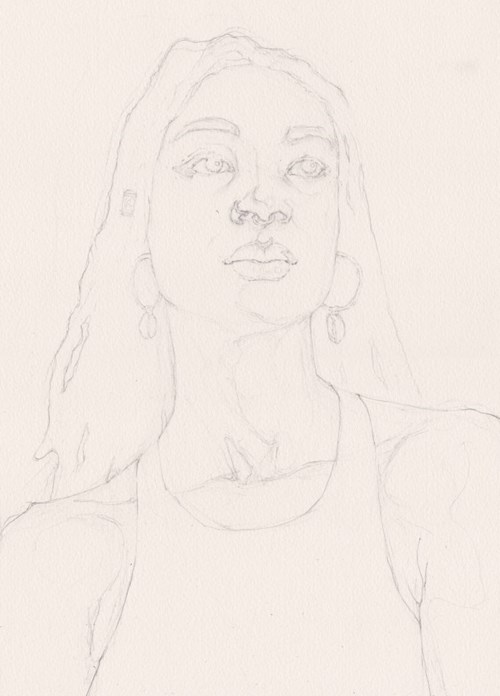
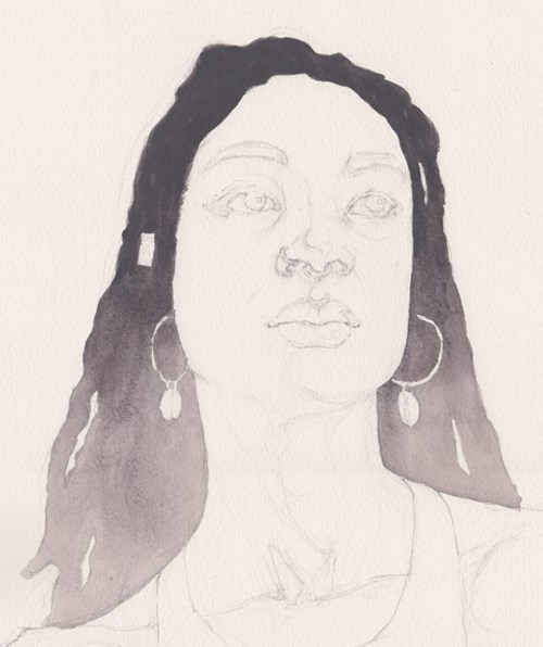
Stage 1: Underdrawing
Material: B Pencil
Time: 20 minutes
After a few warm-up sketches, I started the illustration with an under drawing in Graphic B pencil working freehand from the photograph on an iPad, my paper taped to an angled drawing board. I started loose, becoming tighter as I drew, making firm marks for definite contours and lighter lines at the edges of tonal boundaries.
Stage 2: Hair
Material: Burnt Ember (Tinted Charcoal) and Sepia Ink (Inktense) pans
Time: 10 minutes (left to dry before continuing)
In order to explore a range of different techniques in the image and to create some contrast with the dark tones of Priss’s neck and shoulders, I decided to use a gradient of tone in her hair. I’m not a confident watercolourist, so I practiced a few times on a test sheet first, before filling the shape of her hair with clean water. Working wet-into-wet, I painted a concentrated mix of Burnt Ember and Sepia Ink into her hair from the top down, the angle of my drawing board helping the paint to flow downwards through the water, creating satisfying and unexpected patterns of spreading pigment.
Stage 3: Skin – Initial warmth
Material: Sanguine (Inktense) pan
Time: 15 minutes (left to dry before continuing)
Following the enduring principle of watercolour painting – that one should always work from light to dark – I started with a deliberately uneven wash of Sanguine over the whole of Priss’s skin, working wet into wet and selectively adding colour into the pooled water, leaving the lightest highlights of the skin white. Where I’d found the Tinted Charoal pans to be enjoyably textural, the Inktense pans behave much more like a good quality watercolour and spread evenly through the water unless guided with a brush-tip.
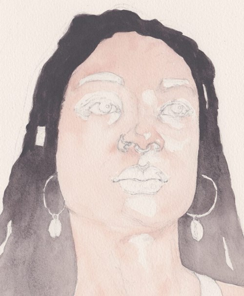
Stage 4: Skin – Warm mid-tones
Material: Venetian Red (Inktense) pan
Time: 15 minutes (left to dry before continuing)
Once the previous layer was completely dry (helped along with a hairdryer), I added a similar layer of Venetian Red over the top, working in exactly the same way as before and focusing the more saturated colour in areas that needed a little more warmth. At this stage the model always looks particularly strange – I know from experience that it is important to trust to the process and that the skin colours will look more balanced at a later stage.
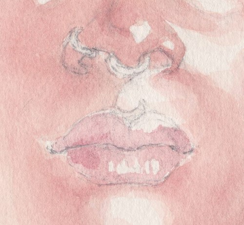
Stage 5: Lip colour
Material: Autumn Brown (Graphitint) pan
Time: 15 minutes (left to dry before continuing)
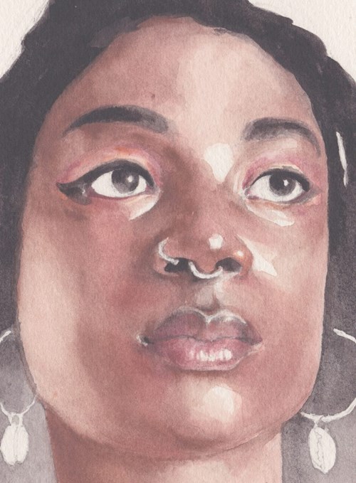
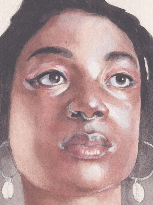
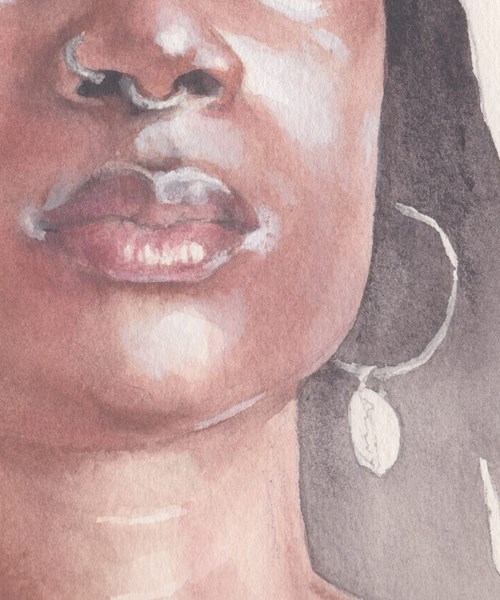
So far I’d avoided features in favour of getting some big shapes of colour established, but at this point I switched to a smaller brush and selectively painted a dilute blush of Autumn Brown Graphitint over the lips, leaving areas of highlight white and adding darker and more saturated colour into the still-wet wash. While the colour was still wet in the palette I added some extra warmth to other features.
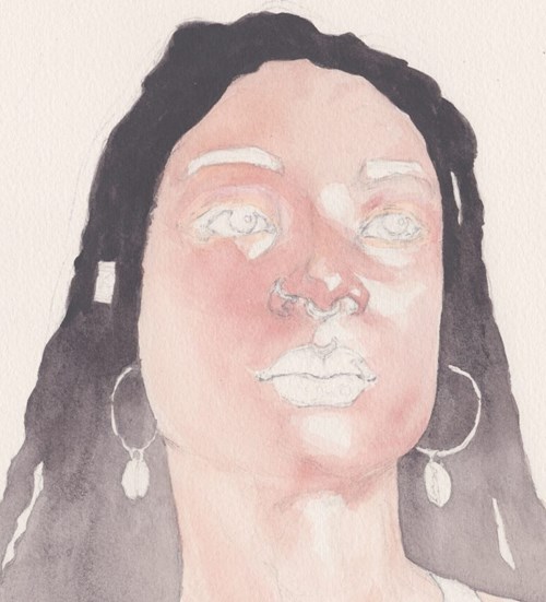
Stage 6: Skin – Darker mid-tones
Material: Sepia Red (Inktense) and Burnt Earth (Tinted Charocal) pan
Time: 20 minutes (left to dry before continuing)
In this nerve-wracking stage, I built up then darker tones of Priss’s skin using the Sepia Red Inktense pan, a particularly rich brown. I worked wet on wet again, adding very concentrated paint into a clean water wash to allow it to bleed outwards, reducing the angle of by drawing board so that it wouldn’t run down that paper. I consciously allowed the left cheek to remain lighter than it appeared in the photograph to maintain contrast with the hair and added a little Burnt Earth to the features in anticipation of the next stage.
Stage 7: Features
Material: Sepia Ink (Inktense), Mars Orange (Inktense), Autumn Brown (Graphitint) and Burnt Earth (Tinted Charocal) pans
Time: 20 minutes (left to dry before continuing)
With a focus on the features, I used a combination of colours painted wet-on-dry to add clarifying details – Mars Orange around the eyes for Priss’s make-up, Autumn Brown in the eyes, nose and lips, with Sepia ink and Burnt Earth to darken the features.
Stage 8: Skin – Cool Opaques
Material: Storm Grey (Pastel Shade), Antique White (Inktense) and Venetian Red (Inktense) pans
Time: 15 minutes
At this stage, the combined pans really came into their own – although I had worked light-to-dark throughout, I now needed to add a little light back over the dark and to inject some balancing cool-ness into a very warm portrait. The Storm Grey (Pastel Shade) pan is remarkably opaque, so tempered with a little Venetian Red (Inktense), I painted it onto the dried paint around the features, cheek and forehead, as well as using it on the white paper to add three-dimensionality to the whites of the eyes.
Stage 9: Jewellery
Material: Graphite Grey (Graphitint) pan
Time: 5 minutes (left to dry before continuing)
I used the one unused pan – the silvery Graphite Grey to embellish Priss’s jewellery, working over the light areas left clean throughout the picture.
Stage 10: Lightest Lights, Darkest Darks & Cross contours
Material: Derwent Onyx Dark pencil
Time: 15 minutes
Finally, once all of the paint had dried fully, I used the Derwent Onyx Dark pencil to add tonal variety to the drawing – pushing the darkest darks even darker. To accentuate form and texture to the drawing, I built up cross-contours on the cheek, neck and forehead.

Thank you to Jake Spicer for providing this blog for us. You can discover his work on his website, Instagram and Facebook.